PetriCore Creative
A cross-cultural brand identity that merges Chinese and Western aesthetics to reflect PetriCore's story-driven design approach.
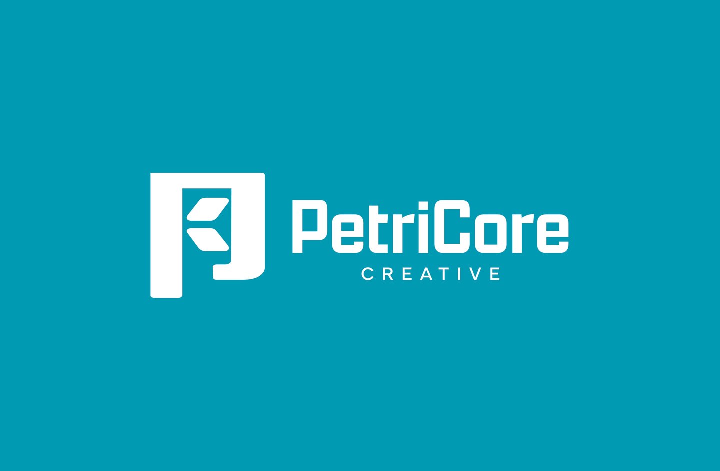
PetriCore Creative is a design studio rooted in clarity, emotion, and quiet impact. Its name blends the Greek petros (stone) and ichor (blood of the gods), symbolizing strength and sacred essence. The word core reflects the heart of its mission: “Work for money, design for love.”
Inspired by petrichor—the scent of rain on dry earth—PetriCore embraces design that evokes presence, renewal, and memory. This becomes a metaphor for its visual work: grounded, intentional, and built to stay.
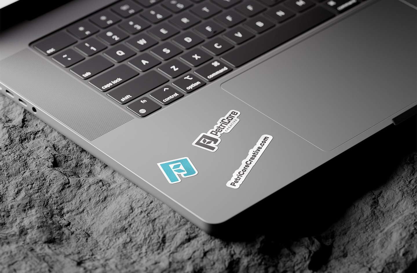
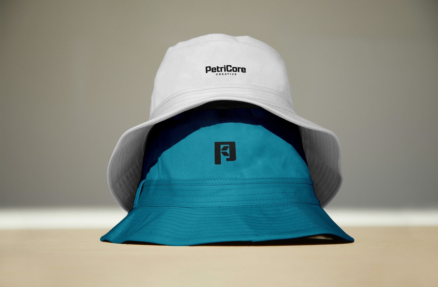
The identity bridges cultures, with a logo that merges the letter P and the Chinese character 雨 (rain), reflecting the studio’s East-meets-West perspective.
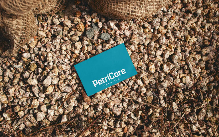
PetriCore’s signature color is Mineral Blue (#0099B2) — a fresh, rain-infused hue that suggests clarity, movement, and emotional openness. Paired with grounding earth tones, the palette evokes a natural tension between water and stone, presence and permanence. This contrast echoes the brand’s core ethos: poetic, balanced, and enduring.
“Inspired by rain, designed to stay” captures PetriCore’s essence — crafting design that feels, lingers, and connects.


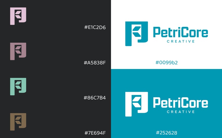
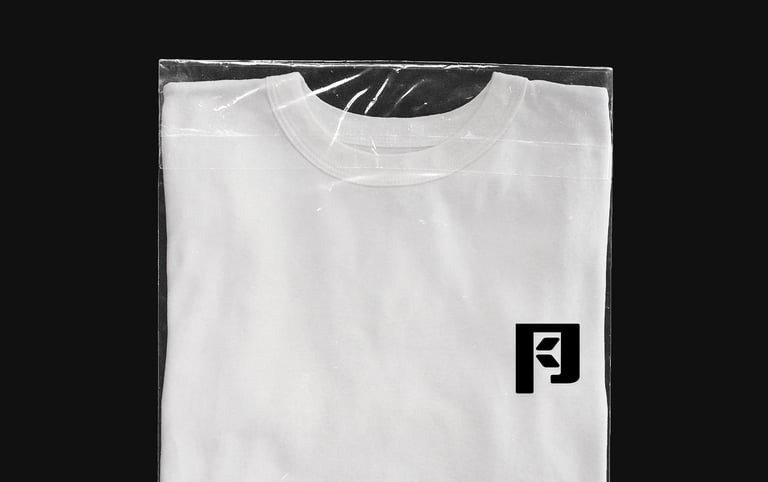
Inspired by rain. Designed to stay.
© 2025 PetriCore Creative, LLC.
All rights reserved.
